The objective of this project was to analyze and create a responsive website that will let the users register/book for the humanitarian cause of donating blood.
The Problem :
The main goal of the Any Time Blood is to provide users with the platform where they can go and easily register/book to donate blood. Despite this, users are not able or have some mindset of not donating blood just because they don’t know where they can do that without wasting their time (Main target audience was immigrants who come to Canada and want to contribute in social good ). Users want to donate blood and need some platform where they can make a booking or registration.
How might I create a website so that users can access the benefits efficiently and satisfactorily?
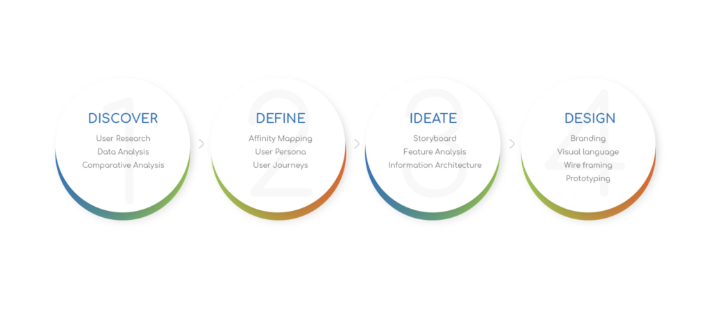
Design Process :
Research :
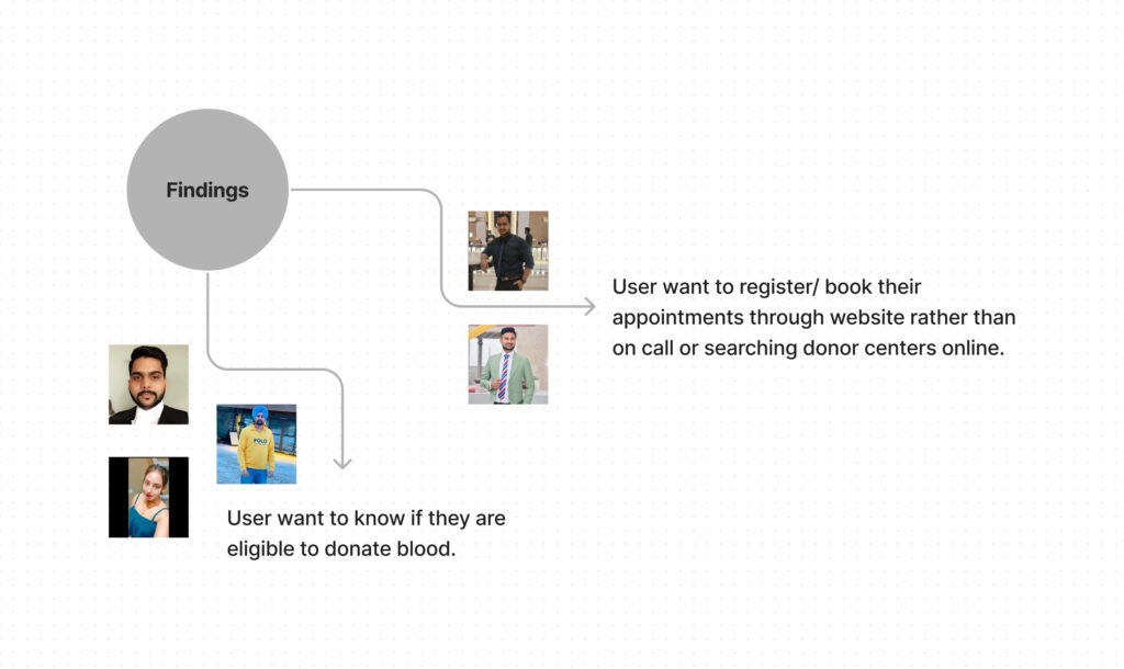
Based on my research, I conducted five user interviews with potential users who want to contribute to humanitarian cause they support.
All the users have one common pain point that mostly they don’t know if there is any platform where they can go and register for blood donation. Moreover, some of the users want to book appointments to donate blood based on nearest donor centre available. Any Time Blood website and app allows users to register/book their appointment to donate blood as per their availability.
User Interviews :
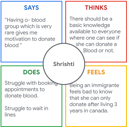
I derived 15 I-statements that I divided into two different user personas. Some of the key I-statements derived were:
There should be a reward system in Canada like certificate/badge.
Should get a ticket so that we can get a blood in return.
There are some restrictions on blood donations in Canada.
Waiting in line is always frustrating.
O- blood always motivates me to donate blood.
Defining a target user :
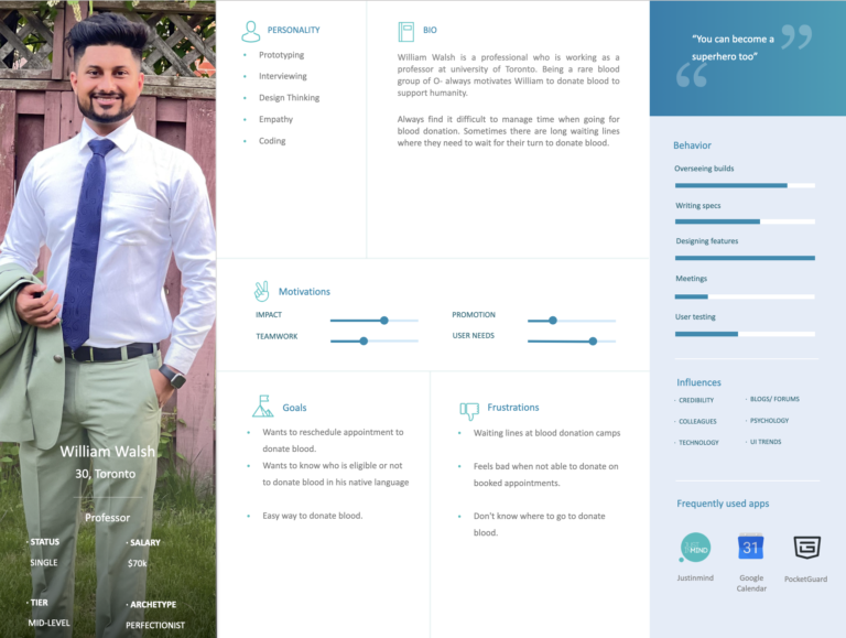
Based on the user interviews I conducted, I created the below primary persona/target user, the Busy Professional Professor.
Problem statement:
William Walsh is a working professional with busy schedule who needs to do a registration to donate blood at his nearest centre location because he believes this is the only way to be a reason to support humanity.
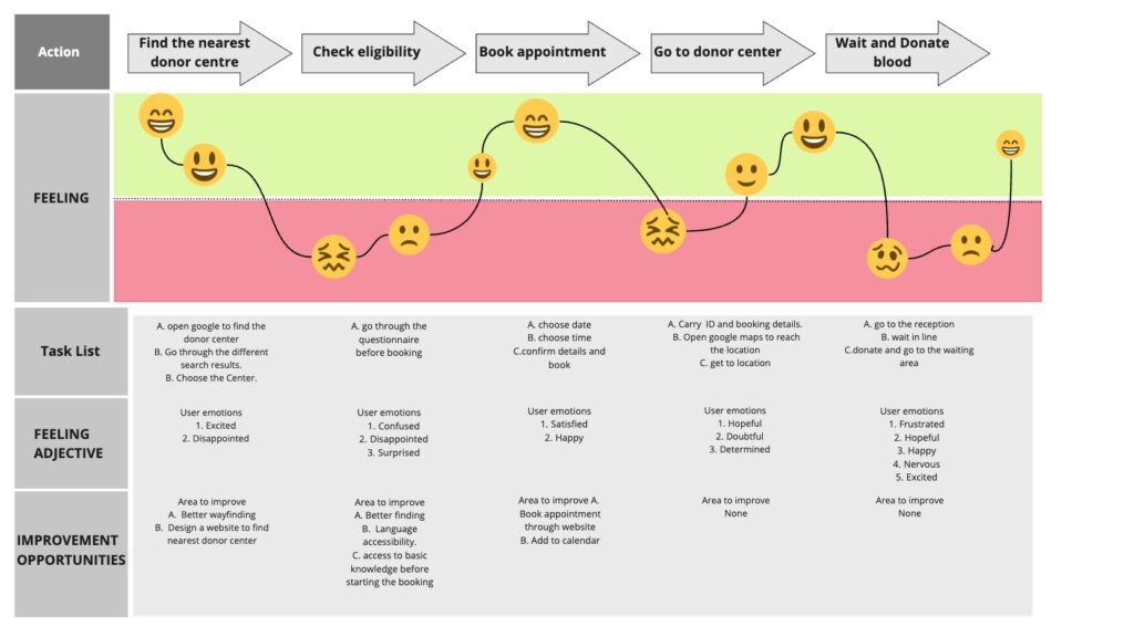
User Journey Map :
This journey map illustrates how William Walsh Book an appointment to donate blood.
Competitive Audit & Analysis :
At Canadian Blood Services website users can go and register to get reliable access to safe, high-quality blood, plasma, stem cells, and organs and tissues. Registration flow is easy and concise. Location accessibility, scheduling is one of the key features on their website.
hnhb healthline is an indirect competitor for our product. This website allows users to find a donor center nearby and users can navigate directly to the website.
ERDO – Emergency Relief and Development Overseas allow users to donate money to support humanity. The web form is easy to find and instructions are clearly mentioned on the website.
Canadian Blood Services
Direct
hnhb healthline
Indirect
ERDO – Emergency Relief and Development Overseas
Indirect
Starting the design :
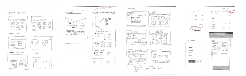
I started designing the prototype by hand-sketching several ideas for different pages. I marked up my work along the way as I came across mistakes or things I wanted to clarify.
Paper wireframes :
Before heading to Adobe XD, I drafted a paper wireframes to get a general idea of the website design and solutions we are providing for the users pain points.
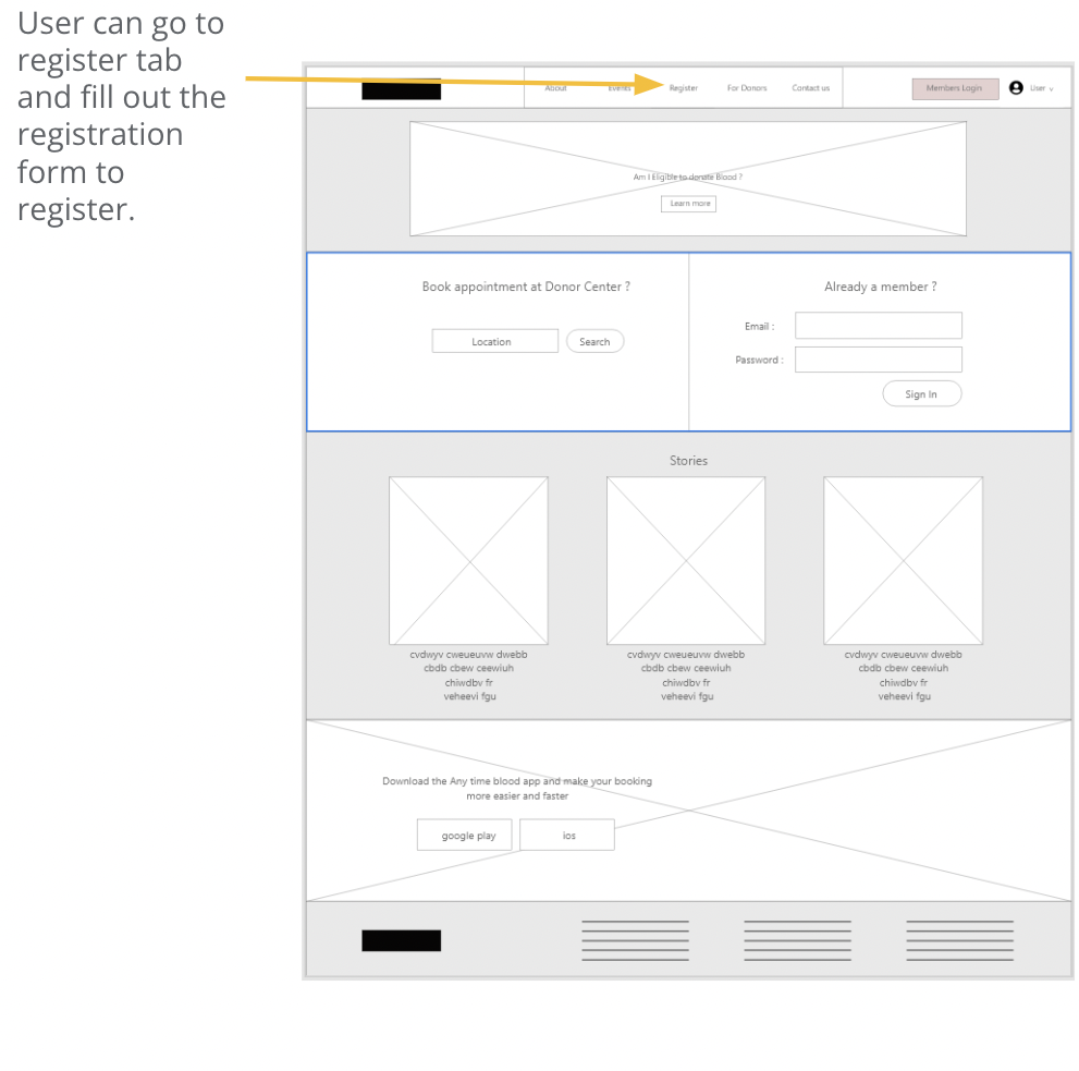
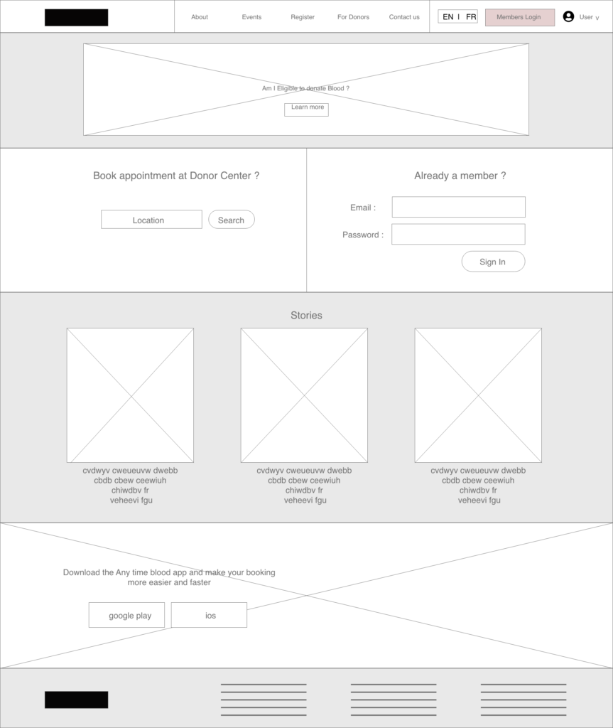
Homepage development : Digital wireframes
After making paper wireframes, I started plugging in my designs into a UI kit on Adobe XD. All of the screens went through a similar development that I’m showing below.
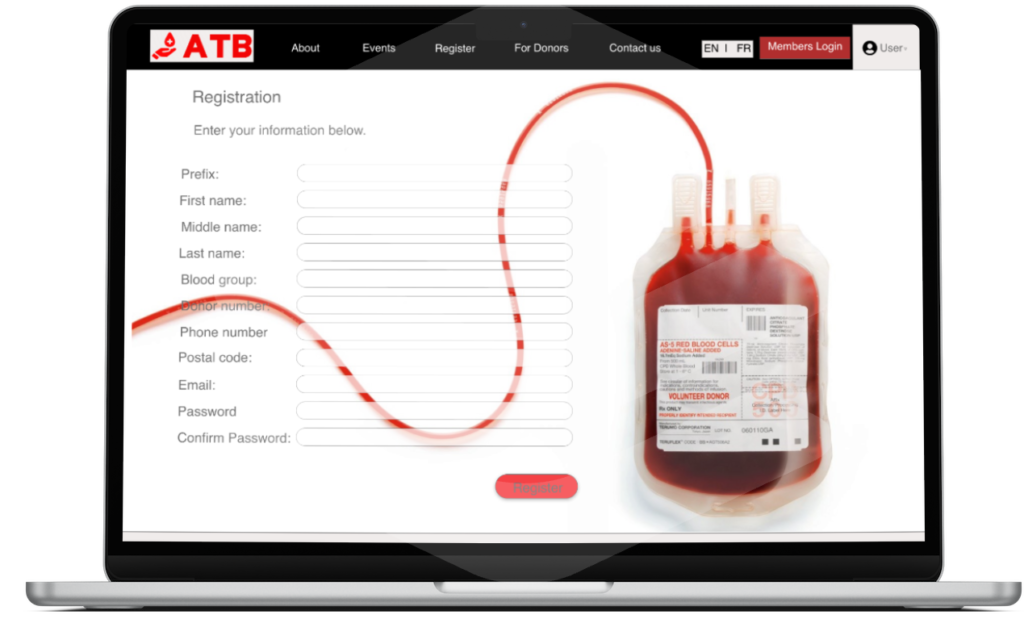
Most of the users want to register and create an account to book appointment directly with donor centre if they want to contribute.
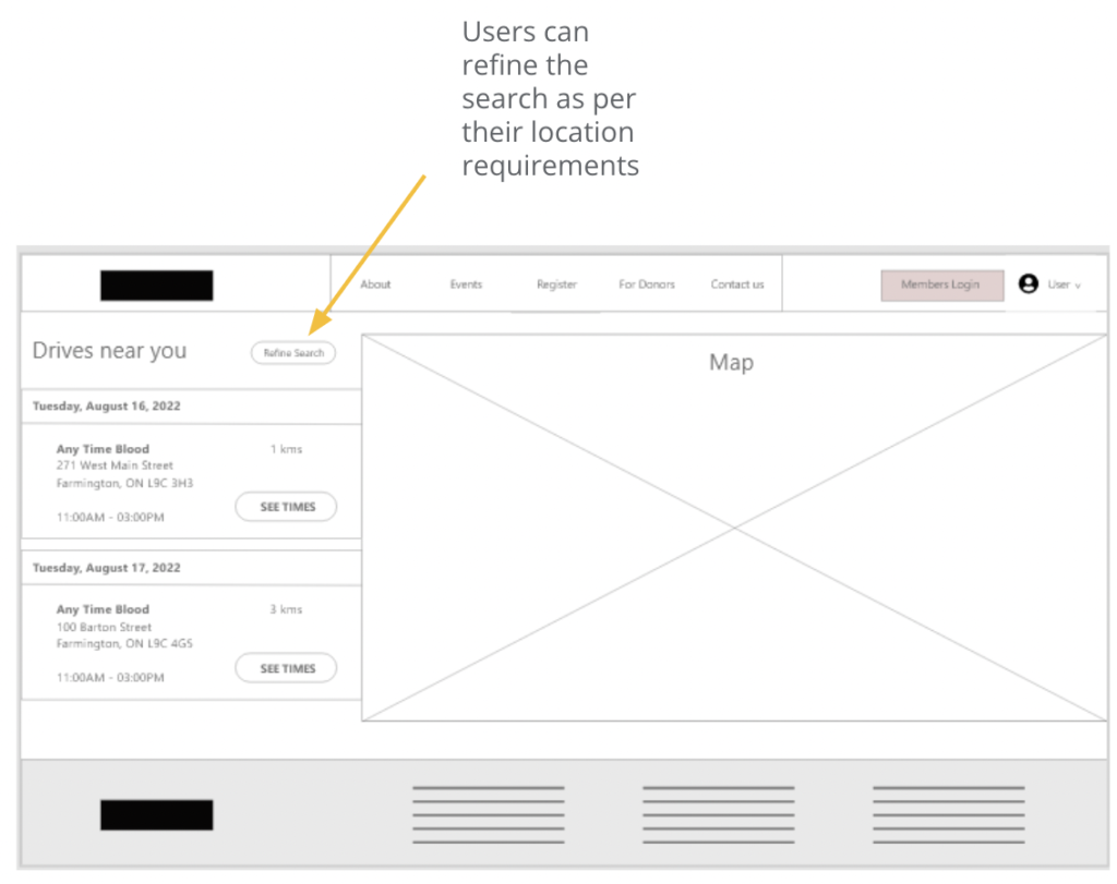
Every user wants to book an appointment at nearest donor centers to save their time.
Usability study: Findings
After doing the initial usability testing there were some user flow issues that need to be fixed and I found user pain points that need attention to make the user experience better.
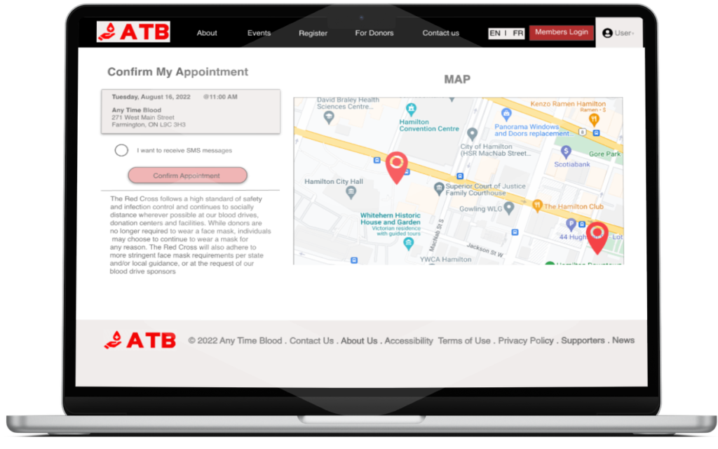
There should be a change language feature at the top of the website so that people with language barriers can also read and do their registration.
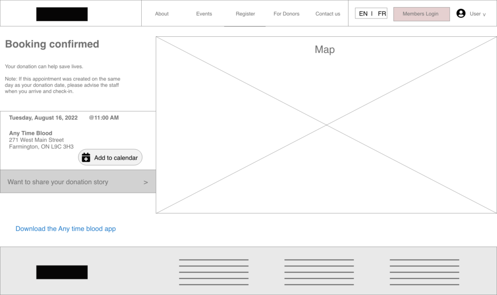
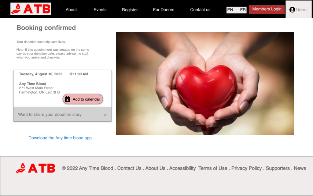
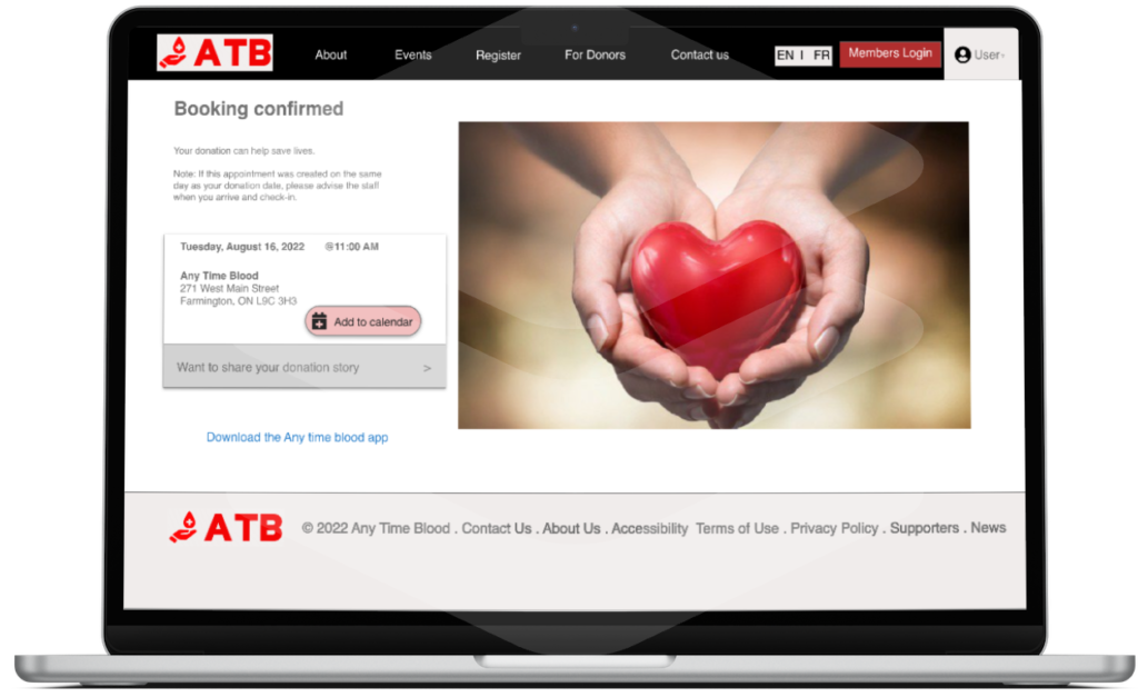
After the booking is confirmed there should be an another Add to calendar option so that people with busy schedule can manage their routine.
Before Usability Study
After Usability Study
Before Usability Study
After Usability Study
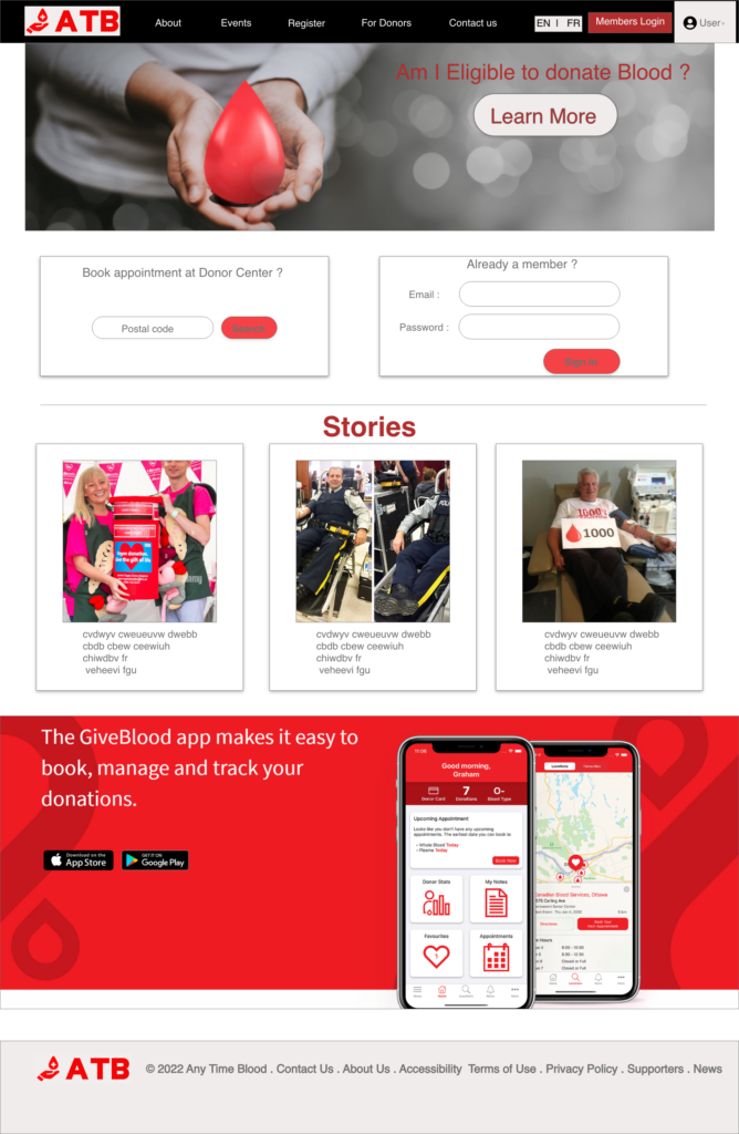
Final Mockups :
Takeaways :
Impact
Doing usability study after particular time Phase, is what makes the design better. It made my design more user friendly and made the experience more enjoyable.
What I learned
I learnt that it's not always the best, what you think so taking feedback from others is what makes your design and experience perfect.