Mobile app where users can learn how to perform CPR in easy steps.
OVERVIEW
The aim of this project was to solve the problem of large group of people who want to learn how to perform CPR just for their knowledge by means of an app.
In a cardiac arrest emergency, every second counts. If performed immediately, CPR can double or triple a person’s chance of survival.
Learning how to perform CPR is very frustrating for some users who don’t have time to attend classes.
Some people want to learn about CPR in their native language.
User research
I have done my user research, interviewing 5 people who were doing full time jobs and don’t know how to perform CPR if they need it.
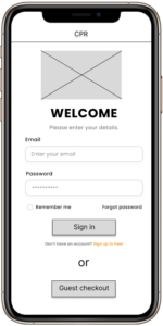
Based on my Qualitative research I found one thing common among all the participants that most of them wanted to learn how to perform CPR for their knowledge but don’t want any certification or pay for that.
Persona : Lakshpreet Kaur
Problem statement:
Lakshpreet is a dispatcher who deals with people over phone and give instructions. Lakshpreet wants to learn how to perform CPR in easy steps because she believes we never know when we have to perform it.
CREATING A JOURNEY MAP
I created a journey map to help me visualize the experience that user goes through if someone wants to learn how to perform CPR. Moreover I’ll identify pain points & improvement opportunities.
Starting the design
Paper wireframes
Digital wireframes
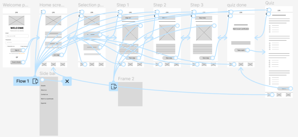
Low-fidelity prototype
Usability studies
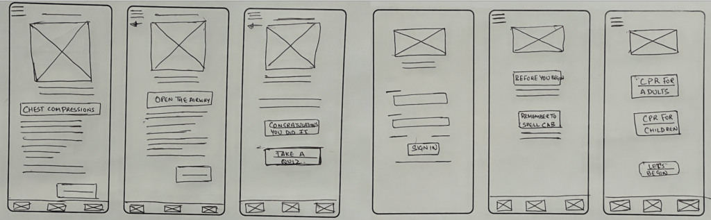
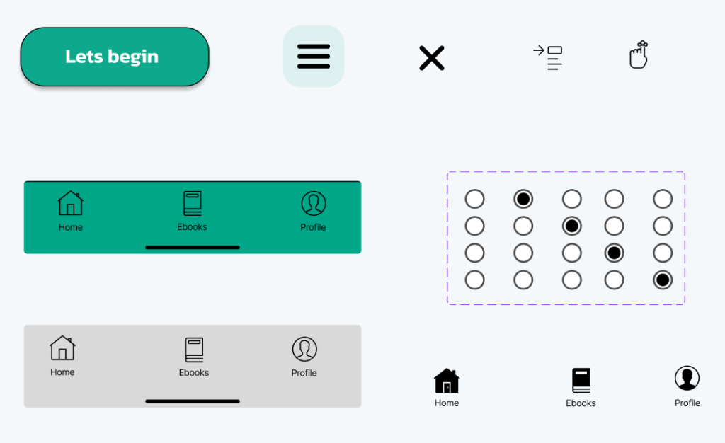
Paper wireframes
Before heading to Figma, I drafted a paper wireframes to get a general idea of the app design and solutions we are providing for the users pain points.
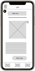
Digital wireframes
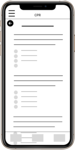
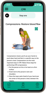
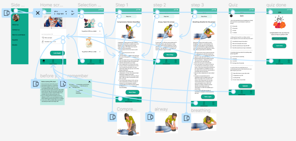
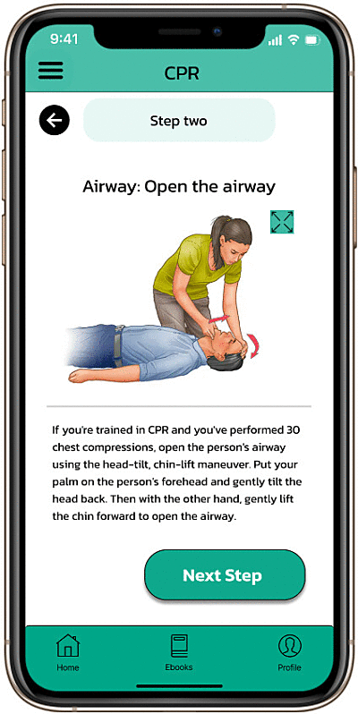
Users want to learn how to perform CPR in easy steps. I tried to meet the expectations by putting visual images at every step when user is going through it.
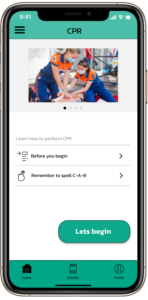
Low-fidelity prototype
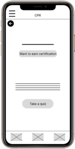
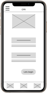
Low-fidelity prototype illustrates how user can choose the preferred selection they want to make and go through the different steps. At the end user learn more by taking a short quiz.
Usability study: findings
After doing the initial usability testing there were some users flow issues that need to be fixed and I found user pain points that need attention to make the user experience better.
Some users want to zoom in to the pictures attached in different steps.
There should be a pop up message if the user taps the wrong button.
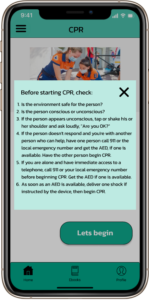
CPR app allows user to learn how to perform CPR in easy steps. Users can see the images at every step and get clear view of how to perform specific action. Moreover, users don’t have to pay to learn these steps if they don’t need any certification.
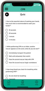
In addition to this, Users can go through a short quiz also to test their knowledge about the steps involved in performing CPR.
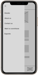
Accessibility considerations :
While conducting usability study I found some participants want to learn about CPR steps in their native language. therefore, it’s good to put change language feature for accessibility.
Making the icons clear and concise to enhance the user experience.
What I learned :
Simplicity is strength
As a designer, we are often amazed by attractive or out of the box designs. But, I believe that one must always remember ‘why we are doing this work’. The primary goal is to understand the user, their problems and then come up with a design that solves it.