I have done my user research, interviewing 5 people who were doing full time jobs and usually loves to go out with their family and friends to watch movies at big screen.
Based on my research, all the users have one common pain point that mostly they have to wait at ticket counter to their movie tickets. Moreover, some of the users were not fond of movies but they only go out with their loved ones just because they want to spend some quality time. For the users like this they always wanted to know the movie details before booking. for eg: rating, genre etc. Based on my research, Simplybook allows users to book movie tickets in advance and users can see the movie details while browsing.
Pain Points :
User would like to book a movie ticket without waiting in queue while in theater.
User want to pay for tickets with different payment options
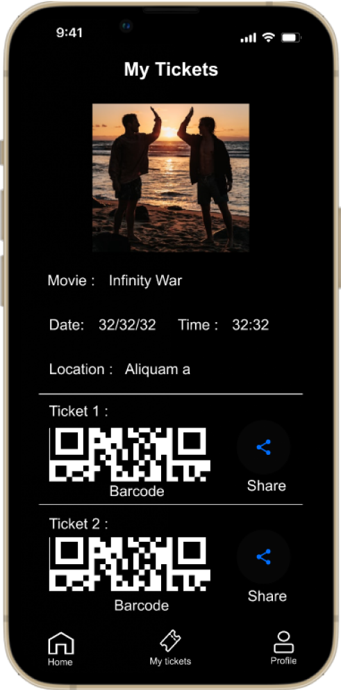
User want to share or invite people for a movie by sharing ticket details with each other.
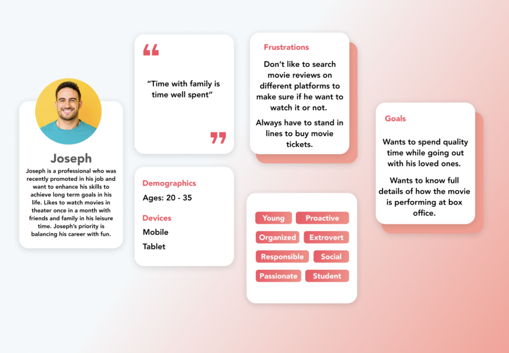
Persona:
User journey map:
This journey map illustrates how Joseph books movie tickets.
Starting the design:
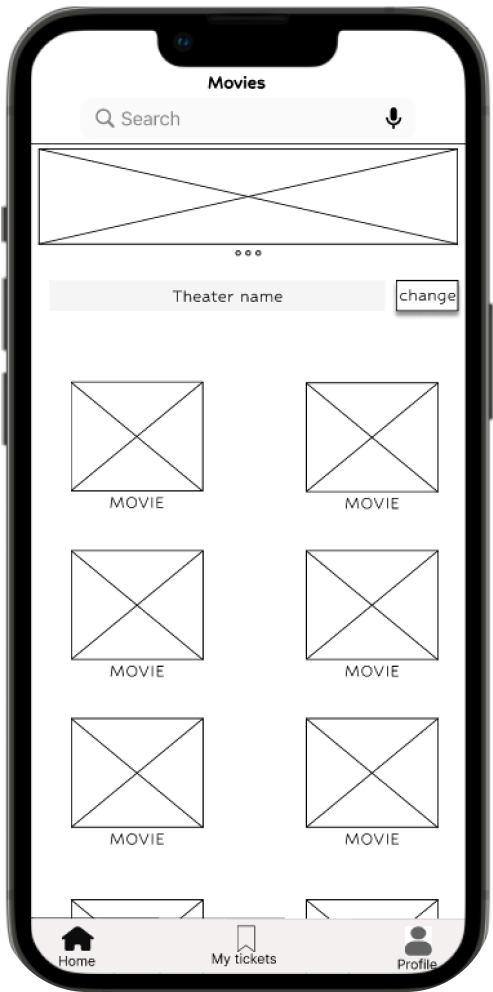
Paper wireframes
Digital wireframes
Low-fidelity prototype
Usability studies
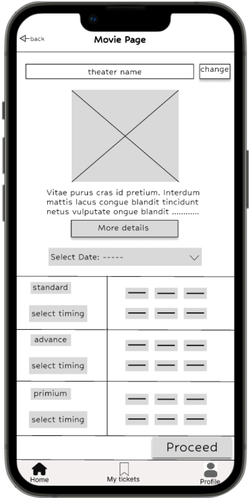
Paper wireframes:
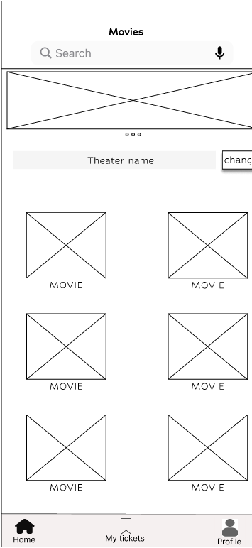
Before heading to figma I drafted a paper wireframes to get a general idea of the app design and solutions we are providing for the users pain points.
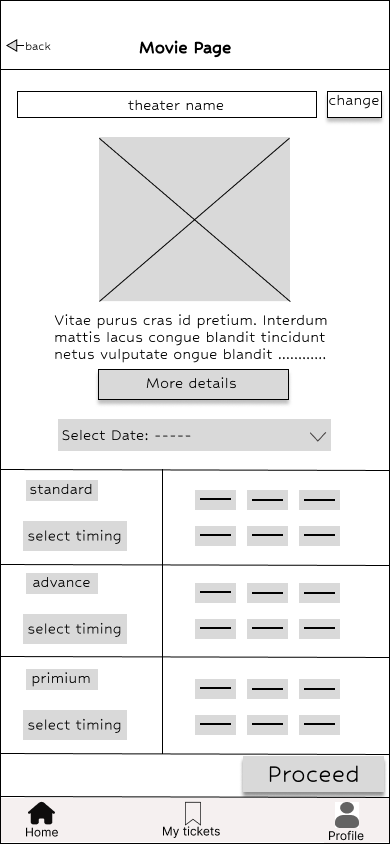
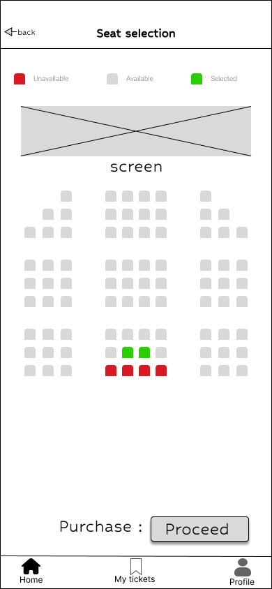
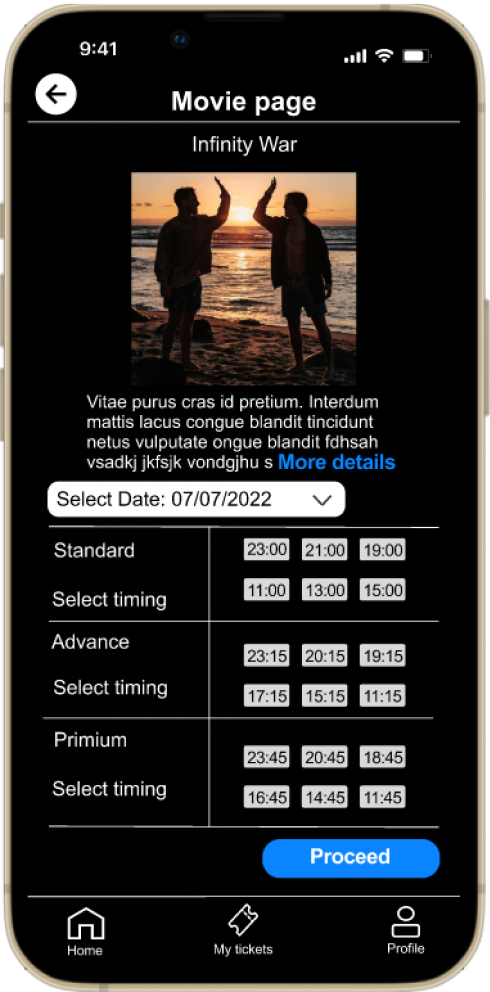
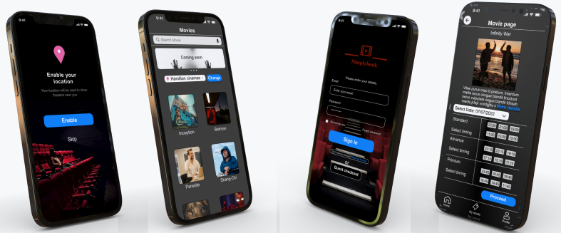
Digital wireframes :
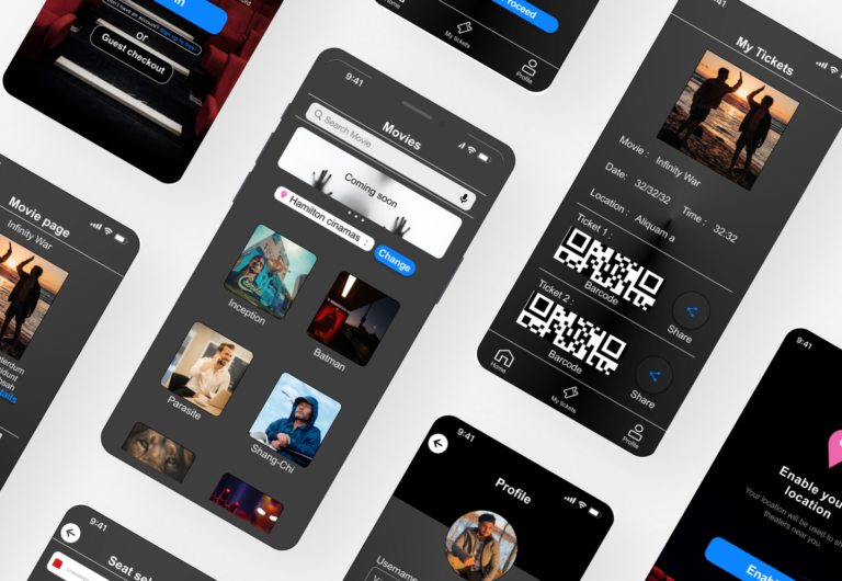
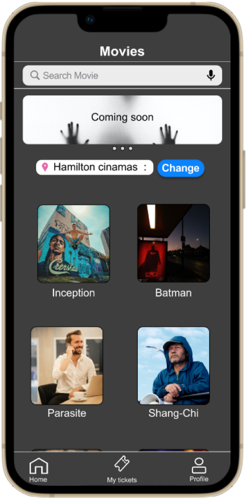
Some users want to watch the movie at location which is not close to their home. Change location button at the home page makes the experience better for the users.
Usability study: findings
After doing the initial usability testing there were some user flow issues that need to be fixed and I found user pain points that need attention to make the user experience better.
There should be a pop up message if the user presses any button which leads to the homepage to start the booking again.
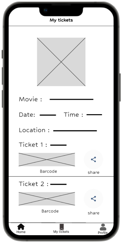
There should be a new feature to share the tickets through the app.
There should be a more clear and easy way to access movie information users are looking for.
Refining the design
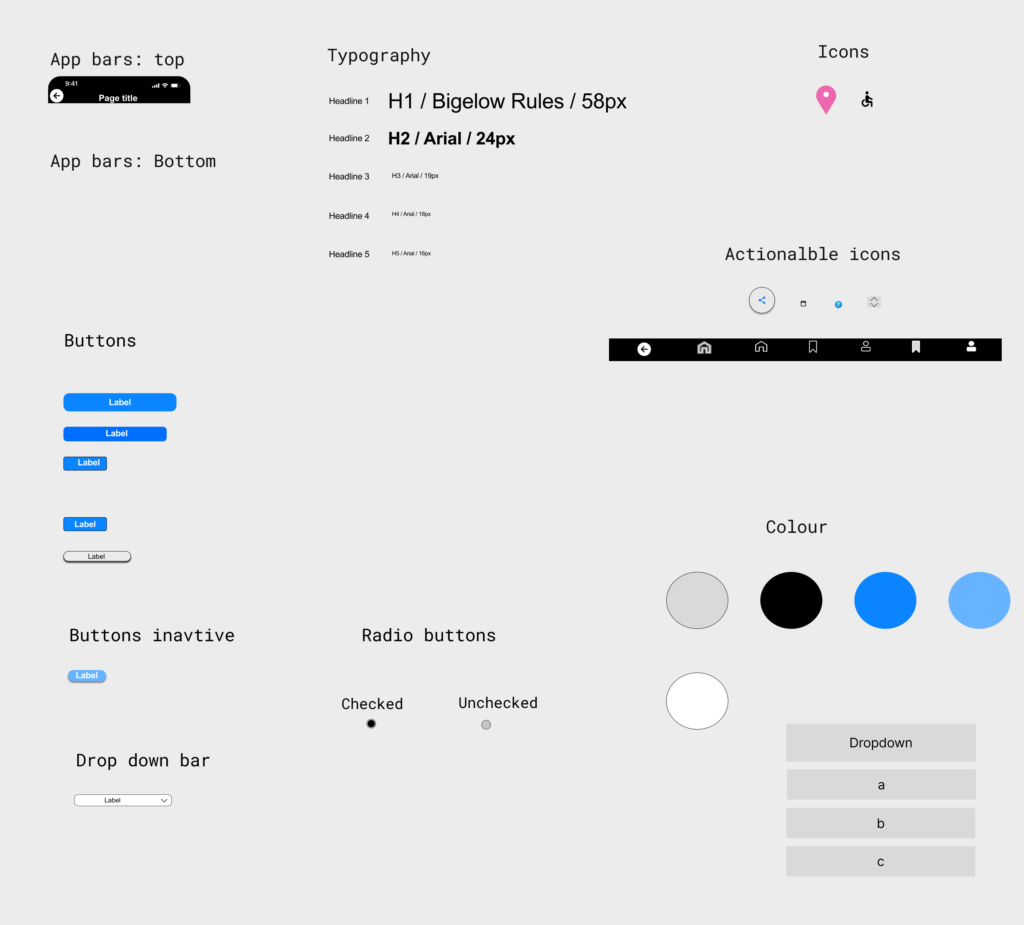
Sticker sheet:
I have made some components so that i can make changes quickly just in case if I need any improvements in my design. While coordinating with developers i think sticker sheet plays very important role to make the work easy and quick for the developers. I put some extra time on this to make the job easy.
Making the icons clear and concise to enhance the user experience
Color contrast should be up to the standard
Text size should be readable and use of placeholder text in search option
Takeaways:
Impact:
Doing usability study after particular time frame is what makes the design better. It made my design more user friendly and users are able to book the movie tickets with good user experience.
What I learned:
I learnt that it’s not always the best what you think so taking feedback from others is what makes your design perfect.